From neighborhood roaster to DC coffee destination — a rebrand that tripled foot traffic in 6 months.
Revolution Coffee had the beans, the baristas, and the passion. What they didn't have was a brand that reflected the quality inside the cup.
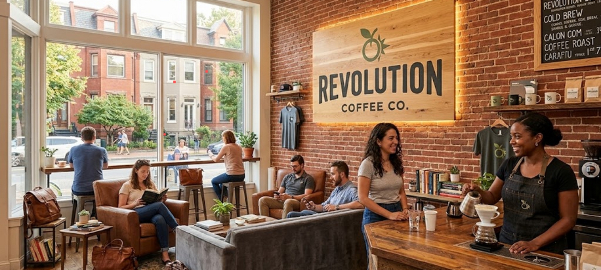
Their existing identity — a generic script logo and mismatched packaging — made them invisible in a neighborhood packed with coffee options. Customers assumed they were just another Starbucks alternative. They needed to stand for something.
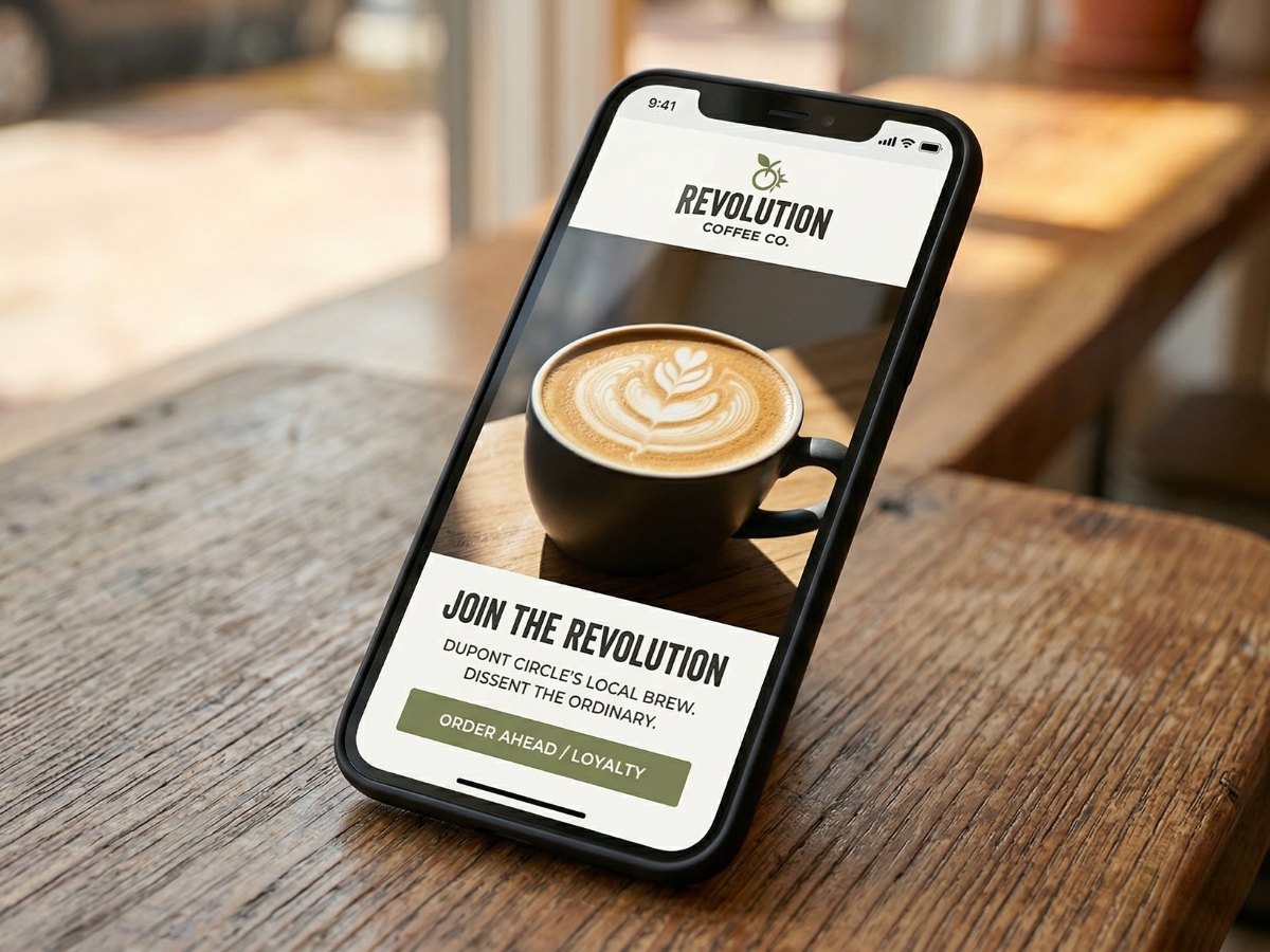
We started with a simple truth: Revolution wasn't selling coffee. They were selling craft, community, and a better way to start your morning.
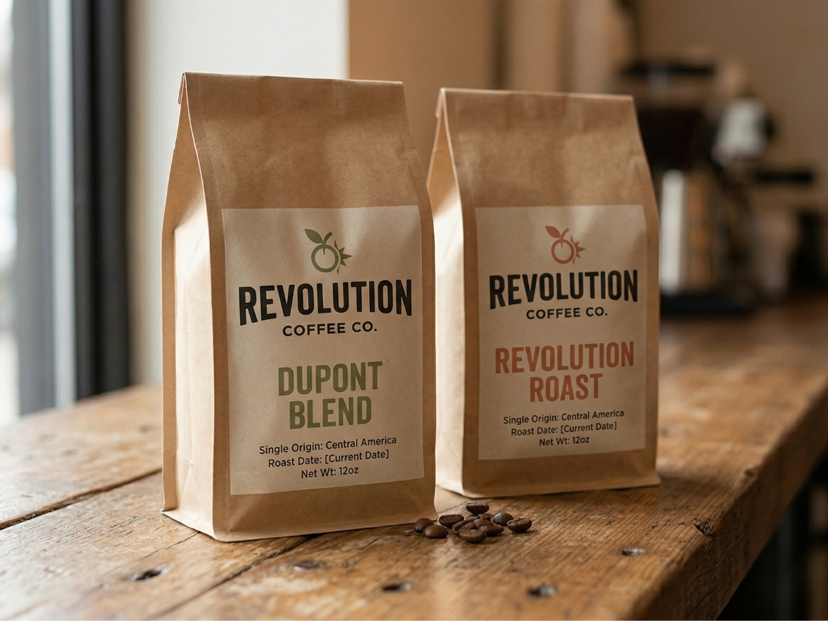
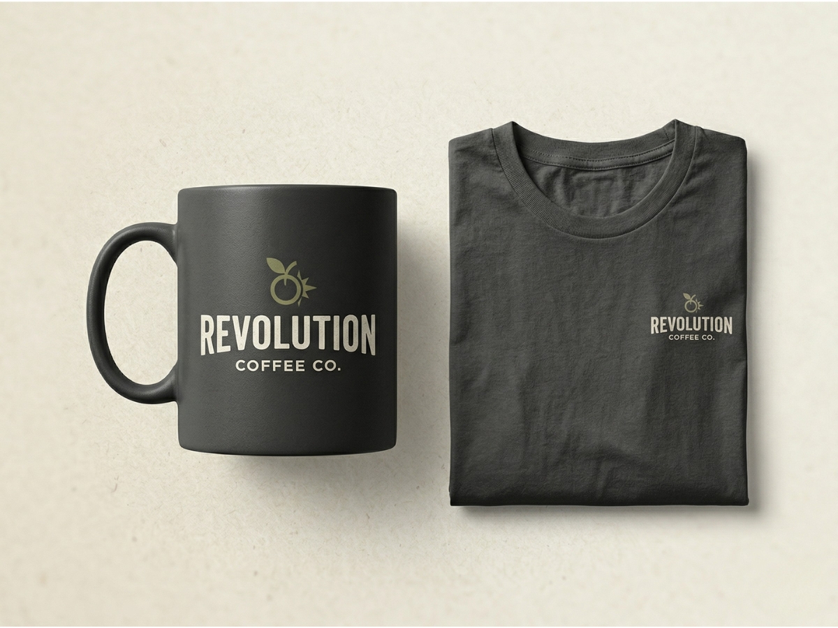
Through stakeholder interviews and market research, we identified three core brand pillars: Uncompromising Quality, Community Hub, and DC Proud. The new logo strips away coffee clichés — no beans, no steam, no brown. Instead, a bold geometric "R" built from negative space.
Foot traffic increase in 6 months
Higher average transaction value
New locations opened in 18 months
"Simplicity gave us a brand that finally matches the quality of our coffee. We went from being overlooked to being the coffee shop people seek out. The rebrand paid for itself in three months."
— Sarah Martinez, Owner & Head Roaster