Modernizing a legacy dental practice to attract younger DC professionals.
District Dental had been serving Dupont Circle for over two decades. Their clinical reputation was impeccable — but their brand was stuck in 2005.
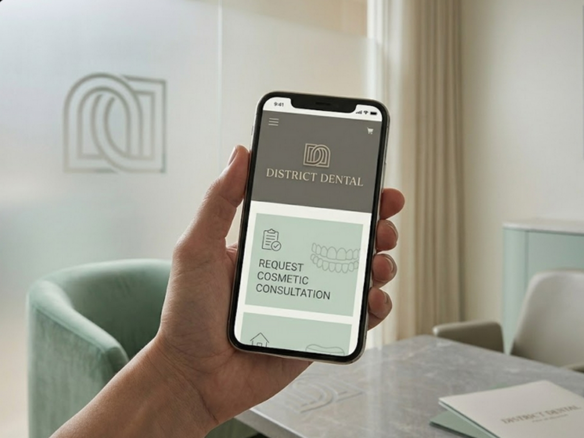
An outdated website with stock photos of smiling families, a clip-art tooth logo, and zero online booking capability. Younger professionals in the neighborhood were choosing sleek, modern practices with Instagram-worthy interiors and frictionless digital experiences.
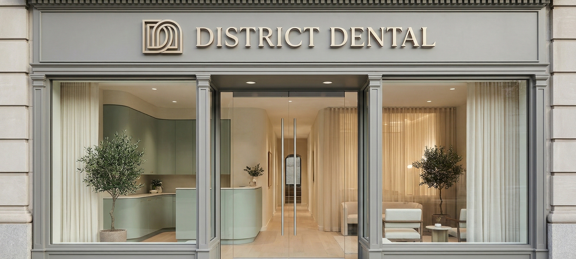
We didn't throw away twenty years of trust. We translated it into a visual language that a 28-year-old Dupont Circle renter would instinctively respect.
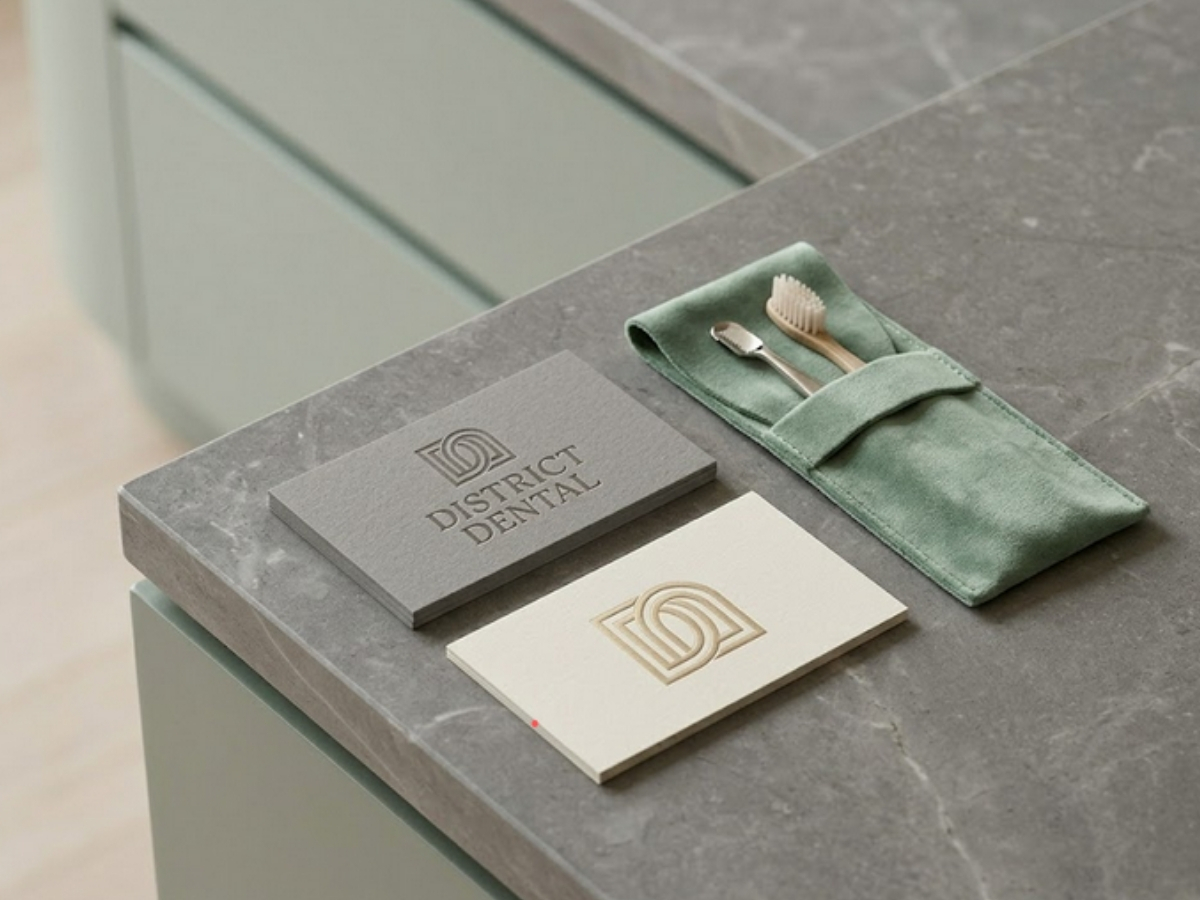
The brand refresh kept the warmth and approachability of the original practice while stripping away every visual cliché in dental marketing. No more tooth icons, no more clinical blue. The new identity uses a confident, geometric wordmark and a sophisticated palette of deep navy and warm cream.
New patient increase in first year
Younger demographic shift (25-39)
Average rating across all platforms
"We were terrified of losing our loyal patients by changing our look. Simplicity found the perfect balance — modern enough to attract new patients, familiar enough to keep the ones who've been with us for years."
— Dr. Rebecca Okafor, Lead Dentist & Practice Owner